
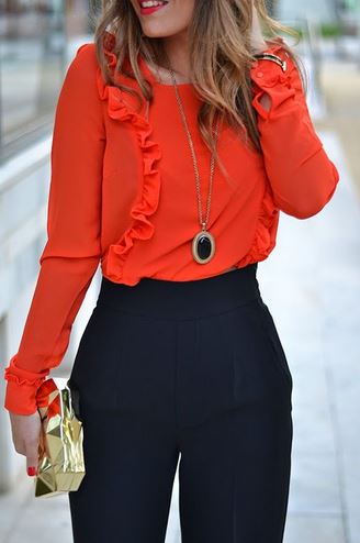
2) Opposites attract: play with color contrasts
Magic of color, a beautiful association can also work by opting for two opposite colors on the color wheel. And yes, a contrast, although stronger and bolder than a harmony or a monochrome, is a very nice way to wear color without a lapse in taste!
It’s a matter of placing two opposing colors next to each other that will become complementary. Specifically: blue and orange, yellow and purple, pink and green. Thus confronted, our two contrasting colors engage in a dialogue to determine which one is the most beautiful, and they create a bright and stylish result.
By extension, it’s anything that will create a little visual shock, that will catch and stop the eye, like yellow and black, which is the most striking contrast for the human eye. But we can also come back to the notion of intensity seen above, and this time go for opposite intensities. It’s a bit more advanced and sometimes challenges our preconceived ideas, but take a pale pink and a bright red, or a golden yellow with a mouse gray: they look great together!